Lumea
11 million family caregivers in France manage one of the most complex administrative systems in the world — with a notebook and a WhatsApp group.
A population the system
forgot to design for.
France has approximately 11 million family caregivers — people who support a relative experiencing loss of autonomy, disability, or chronic illness. They are not healthcare professionals. They receive no systemic training. And yet they coordinate medical appointments, manage social benefit applications, track legal deadlines, and relay information between hospitals, insurance companies, and government agencies.
The public sector provides fragmented support: a caregiver card with limited recognition, a national information hotline, and a patchwork of local services. None of it is designed around the actual workflow of someone managing care. The information lives in PDFs on government websites, in conversation with social workers, or not at all. Every caregiver rebuilds the knowledge graph from scratch.
The private market hasn't filled the gap either. Existing tools either target healthcare professionals or offer generic productivity solutions not designed with the administrative specificity of caregiving in mind. The opportunity was clear: build the operational infrastructure that caregivers actually need.
Not just the visual lead —
the design decision-maker.
As Head of Design in a team of 7, I owned the full design scope: research synthesis, information architecture, UX across all three features, visual identity, and the investor pitch deck. The role went beyond execution — I was accountable for design decisions when the team disagreed, and for making the case for those decisions to stakeholders.
When our first direction hit legal blockers, I reframed the problem and built the case for a narrower, more actionable scope — reducing caregiver mental load through operational assistance. This wasn't a team consensus; it required convincing.
The team initially explored connecting to government APIs via FranceConnect to auto-populate the user's situation. I rejected this in favor of a short questionnaire — faster to build, zero dependency on state infrastructure, and full user control over what they share.
Organizing documents by administrative folder (APA, MDPH, Mutuelle) rather than by document type was a deliberate choice. It mirrors how caregivers think about paperwork — by institution or procedure, not by file format. I held this decision even when testing surfaced edge cases.
The data confirmed the problem.
The interviews defined it.
We ran mixed-methods research with 56 survey respondents and 9 semi-structured interviews (30 min each) with active caregivers aged 32–55. The quantitative data validated the scope. The qualitative data revealed the shape of the problem.
feel they're managing blind. No centralized tool means no overview — just a pile of separate threads to track mentally.
find the administrative system genuinely complex. Not just frustrating — complex. The procedures are interdependent, opaque, and change based on individual situation.
struggle to coordinate with other caregivers. When care is shared between family members, information breaks down at the handoff.
Google Forms survey · 56 respondents · Caregivers aged 32–55
"Admin is an absolute nightmare. I manage by urgency — I never have time to plan ahead." — Rose
"I get by with my agenda and some notes, but there's nothing to bring it all together." — Nadee
"Since I wasn't at the previous appointments, I don't have all the information." — Christine
"If there was an app with all the information and a shared calendar, that would be ideal." — Mary
9 semi-structured interviews · 30 min each · Active caregivers aged 32–55
Three needs emerged: a centralized space for information, filtered guidance through procedures, and shared coordination between caregivers. We chose to prioritize operational assistance — not recognition or emotional support — because it was the only dimension where a digital tool could create immediate, concrete value without requiring institutional or behavioral change outside the product.
We almost built
the wrong thing.
Our first direction asked: how might we give caregivers official legal standing to act on behalf of the person they support? The idea was to build a platform generating a recognized caregiver status — a digital proxy or mandate issued through an app.
We abandoned it for three concrete reasons:
The boundary between guardianship (tutelle) and limited guardianship (curatelle) is defined by court ruling. A proxy issued through an app would have no legal standing — and creating ambiguity around decision-making capacity carries real risk for vulnerable users.
A caregiver card or recognized status requires state approval to have any institutional value. Building a product whose core feature depends on government issuance means zero control over adoption and a multi-year go-to-market delay — at minimum.
Even if we could issue a status, what would it legally authorize? Caregiver rights in France are not clearly defined in law. Building on an undefined legal framework is a liability, not an opportunity.
We reformulated: How might we reduce the administrative mental load of family caregivers — by centralizing the procedures, documents, and deadlines they already manage, without requiring any change to the legal or institutional landscape?
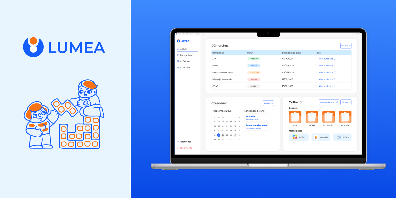
Three features,
three trade-offs.
Each feature maps directly to a research finding. Each came with a design decision that required accepting a constraint.
Caregivers waste hours navigating procedure lists that don't apply to their situation. The administrative system is not personalized — it presents all options to all people.
A filtering algorithm surfaces only the benefits and procedures relevant to each caregiver's specific situation, populated through a declarative onboarding questionnaire. We chose self-declaration over FranceConnect to eliminate the dependency on government API availability and to ship faster.
The questionnaire relies on user honesty and recall accuracy. If a caregiver misreports their situation, the filtering will be wrong. We judged this acceptable: inaccurate filtering is less dangerous than no filtering at all.
Documents are scattered across physical binders, phone camera rolls, and email threads — with no consistent structure. Each new procedure requires hunting across all of them.
A secure document space organized by administrative folder (APA, MDPH, Mutuelle) with built-in checklists per folder. Folder-by-procedure, not folder-by-type — because caregivers think about their paperwork in relation to the institution or benefit, not the document format.
Some documents apply to multiple procedures (e.g., a medical certificate used in both an APA and MDPH application). The folder structure doesn't resolve this well. User testing flagged it. We held the decision: solving for the primary use case was more valuable than over-engineering for edge cases.
Coordination between caregivers relies on WhatsApp groups — information gets lost, and no one has a single source of truth for upcoming deadlines.
A shared calendar synchronized with administrative deadlines, with automatic reminders and visibility across all caregivers in a care circle. Deliberately scoped to administrative events only — medical appointments were excluded.
Medical data falls under RGPD special category protections, and handling it correctly would have required a separate compliance framework. Excluding medical appointments limited the product's utility — but kept it shippable and legally sound within our timeline.
Honest results
from usability testing.
We ran informal usability sessions with a small group of caregivers. Some assumptions held. Others didn't.
Testers reached the right procedure in under 3 clicks without assistance. The filtering logic worked as intended.
The questionnaire was completed without abandonment. Length and cognitive load were appropriate.
Every core use case — checking a deadline, uploading a document, coordinating with family — happens on mobile. We built desktop-first. That was the wrong call.
The document checklists told users what to gather, but not where to get it. Testers stalled. The feature needed actionable guidance, not just a list.
Automatically extracting data from uploaded documents — and pre-filling forms — would remove the most friction-heavy step in the current flow. This is the highest-leverage feature we haven't built.
What shipped.
What I'd change.
Tangible outcomes from the project:
A fully interactive Figma prototype covering all three features, tested with real caregivers.
A deployed AI POC demonstrating document-based interaction — built with no dedicated engineering resources.
An investor pitch deck presented to external stakeholders at the end of the program.
Mobile-first from wireframe stage. The desktop-first decision created rework. Starting with the most constrained viewport forces better prioritization of what actually matters.
Usability testing in low-fidelity. We tested the high-fidelity prototype. Issues found — checklist depth, document organization edge cases — would have been cheaper to fix at wireframe stage.
Co-design sessions with caregivers. We observed and interviewed. We didn't design alongside them. Bringing caregivers into the process earlier — not just as validators — would have surfaced the checklist problem before testing.
The version we shipped is a management tool. The version worth building is an intelligent administrative assistant — one that reads uploaded documents, identifies missing steps, and proactively surfaces what needs to happen next. The AI POC was a first signal. The real product starts there.