
Medical laboratory network
Redesign of the client portal's medical supply ordering module, from field research to prototype, in two steps: the order front-end, then its backoffice.
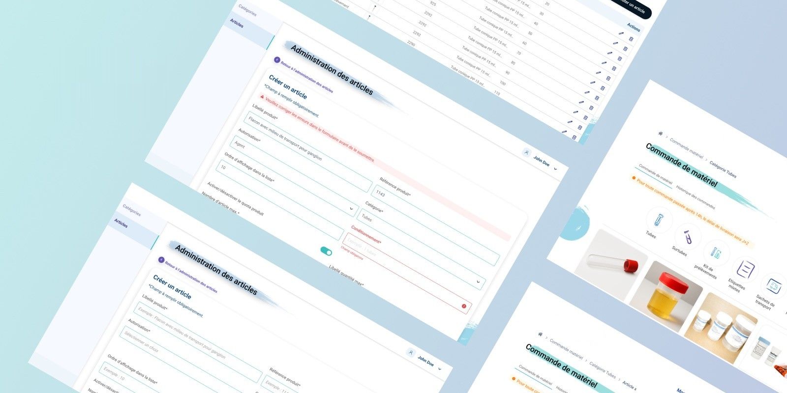
Overview
My role
UX UI Consultant
- Engagement
- Redesign of a business tool
Team
- Product manager
- product owner
- dev team
Details
- Sector
- Healthcare
- Date
- May to August 2025
- Duration
- 4 months
My contribution
- Analysis of user interviews
- Analysis and synthesis of user findings
- Design of the order front-end screens (phase 1)
- Design of the backoffice screens, category and product administration (phase 2)
- Iterations following client feedback
Challenge and problem
A functional but ageing module.
For several years, the client portal has provided a medical supply ordering module (tubes, collection kits, consumables) for partner laboratories. Perceived as broadly stable, it had accumulated a set of operational frictions: ambiguous product labels, no post-order tracking, anatomical pathology (anapath) order issues, and missing technical data sheets.
Three goals
- Modernise the interface
- Improve the end-to-end experience
- Secure technical exchanges through an Azure migration
Two phases
- Phase 1, front-end order redesign. User-side ordering flow: catalogue, product pages, cart and validation. Delivered first.
- Phase 2, backoffice design. Category and product administration. Internal tool for managing the catalogue exposed on the front-end. Delivered second.
User research
8 interviews, recurring and measurable friction.
The research phase ran from May to June 2025. 8 users were interviewed: ADV staff, stock managers, lab technicians, transport manager. I analysed the interviews and took ownership of the analytical synthesis.
- 6/8, missing technical data sheets. Unable to verify storage conditions, leading to customer service calls and ordering errors.
- 6/8, no order tracking. No status visible after order validation; anomalies only detected on receipt.
- 6/8, mixed anapath orders. The system validates non-compliant carts (SAP + SWING mixed) without blocking or alerting.
- 5/8, ambiguous product labels. Difficulty distinguishing tubes, kits and over-tubes; non-intuitive categorisation.
“I never know whether to go into tubes or collection kits, I’m never quite sure which one to pick.”
Methodological limitation
No backoffice users could be interviewed. Phase 2 design relied on indirect needs expressed by ADV teams and labs, without direct validation from administrators.
Flows, wireframes and prototypes
Phase 1, the order front-end
Putting users back in control of their order.
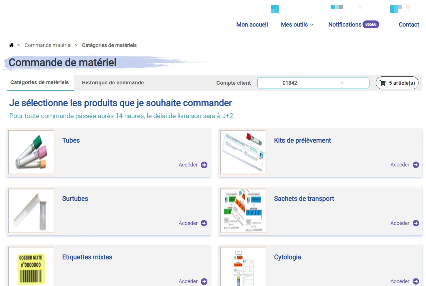
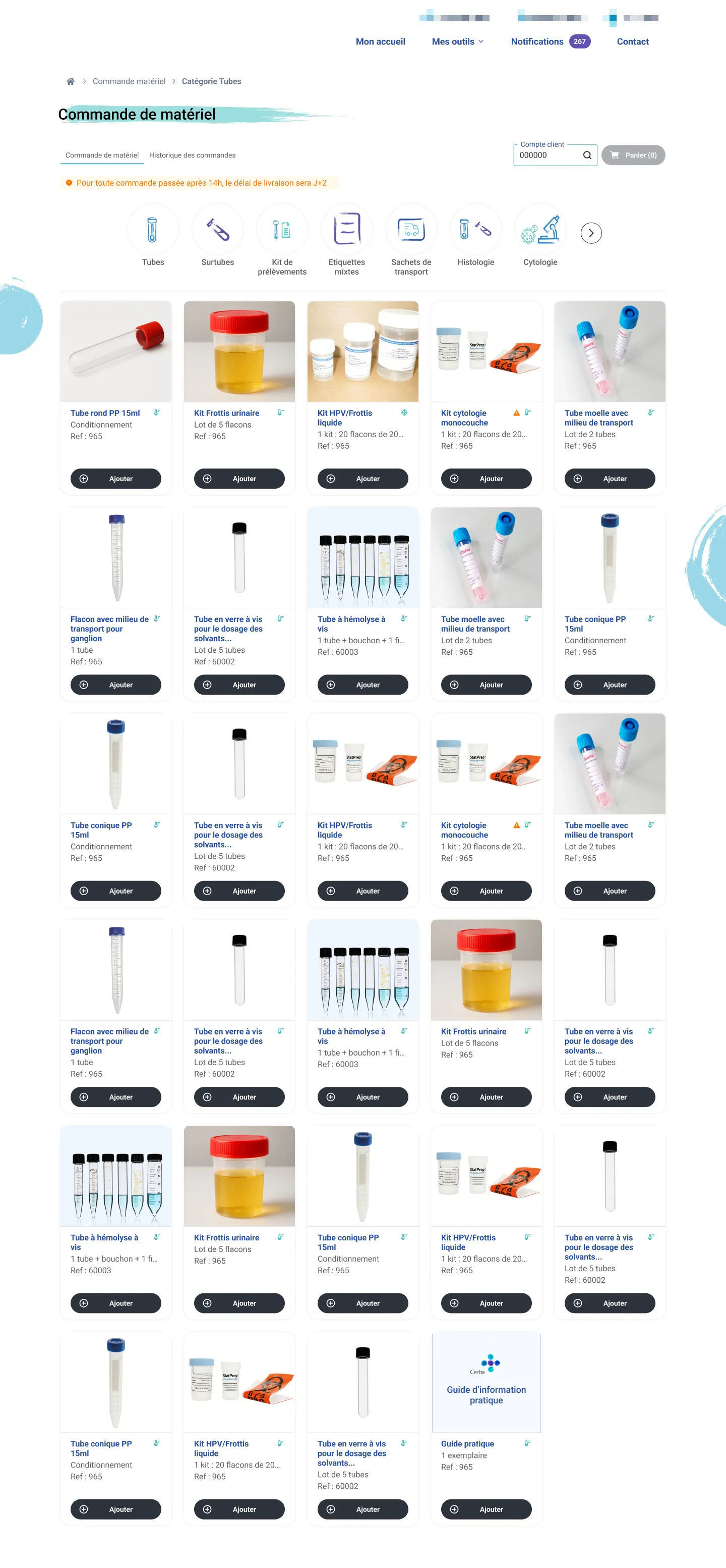
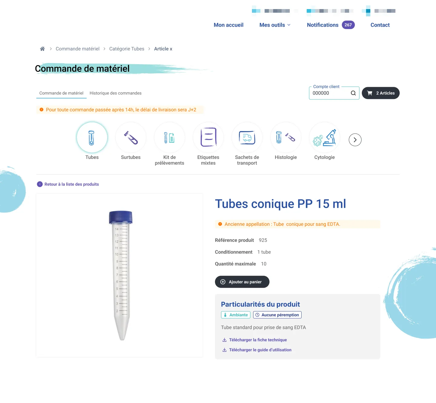
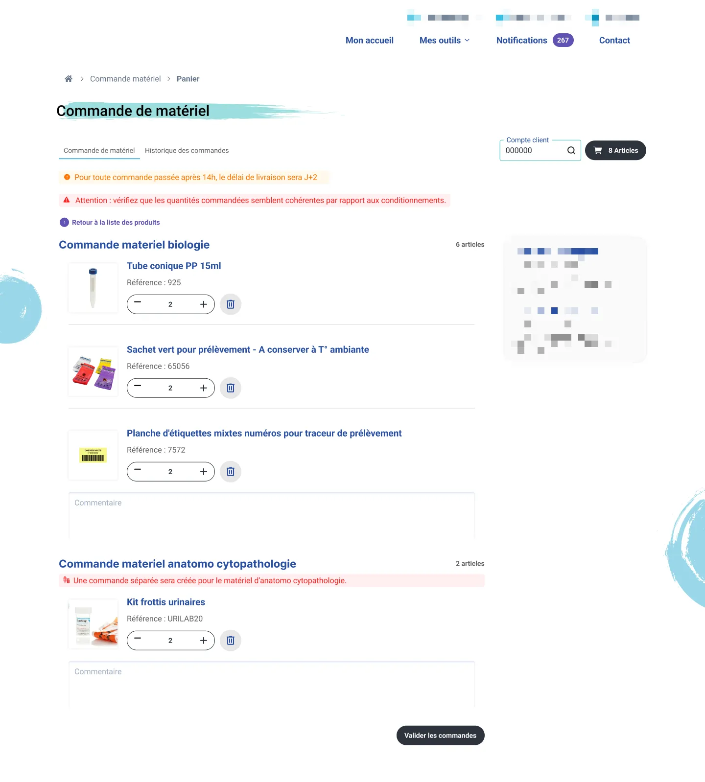
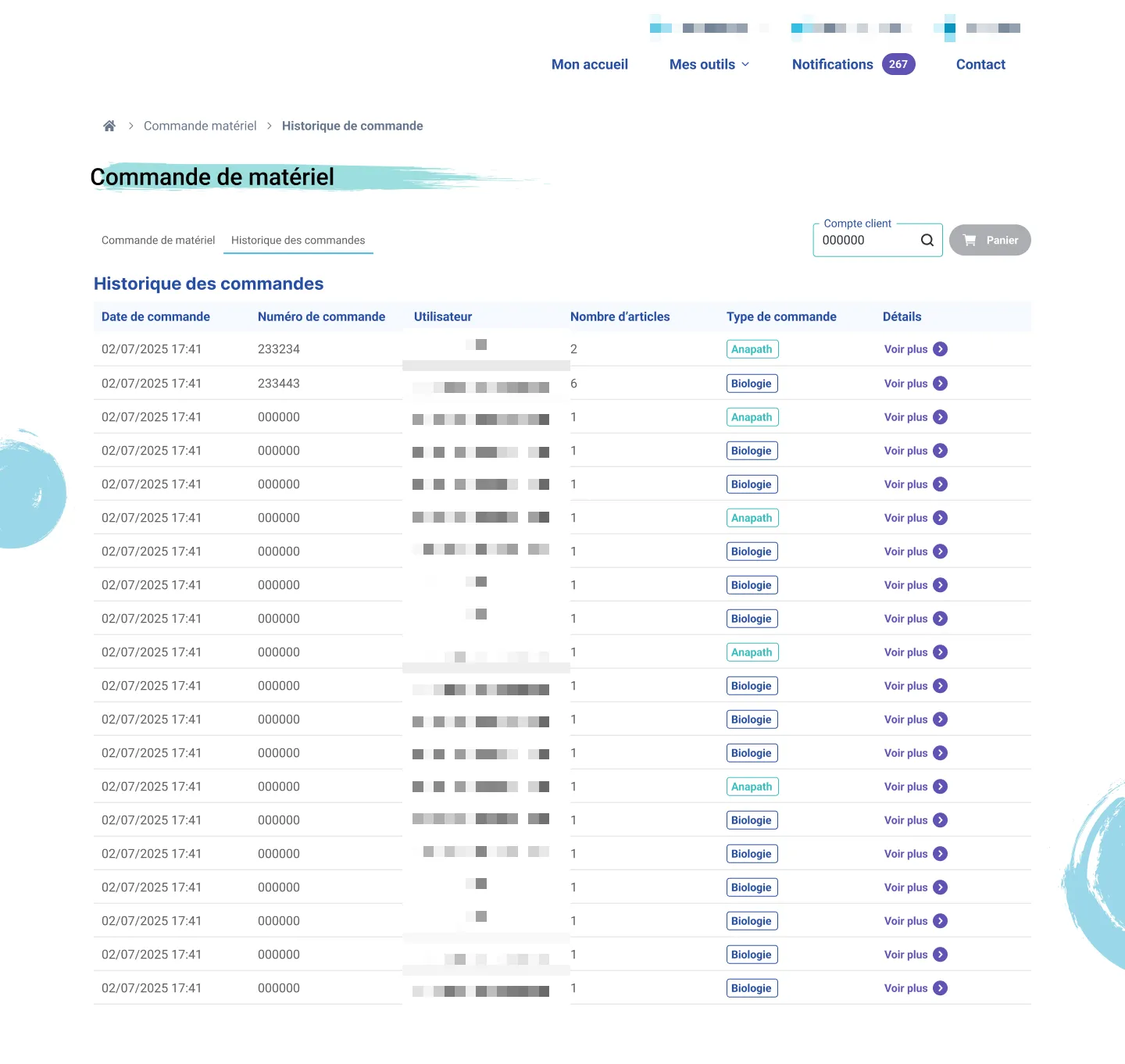
The order front-end was the first scope delivered. It covers the full lab-side flow: catalogue navigation, product page consultation, cart management and order validation. Design decisions were directly informed by the friction identified in research.
| Observed pain point | Design decision |
|---|---|
| 6/8, missing technical data sheets | Technical data sheets built into product pages |
| 5/8, ambiguous product labels | Enriched labels and storage tags (ambient, refrigerated, expiry date) |
| 6/8, mixed anapath orders | Blocking carts that mix anapath items with other categories |
Phase 2, the backoffice
An internal tool serving catalogue quality.
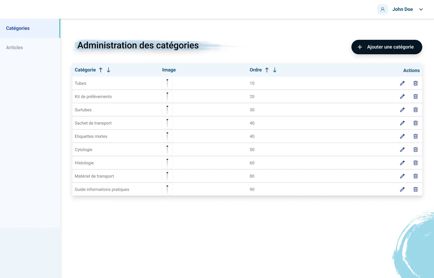
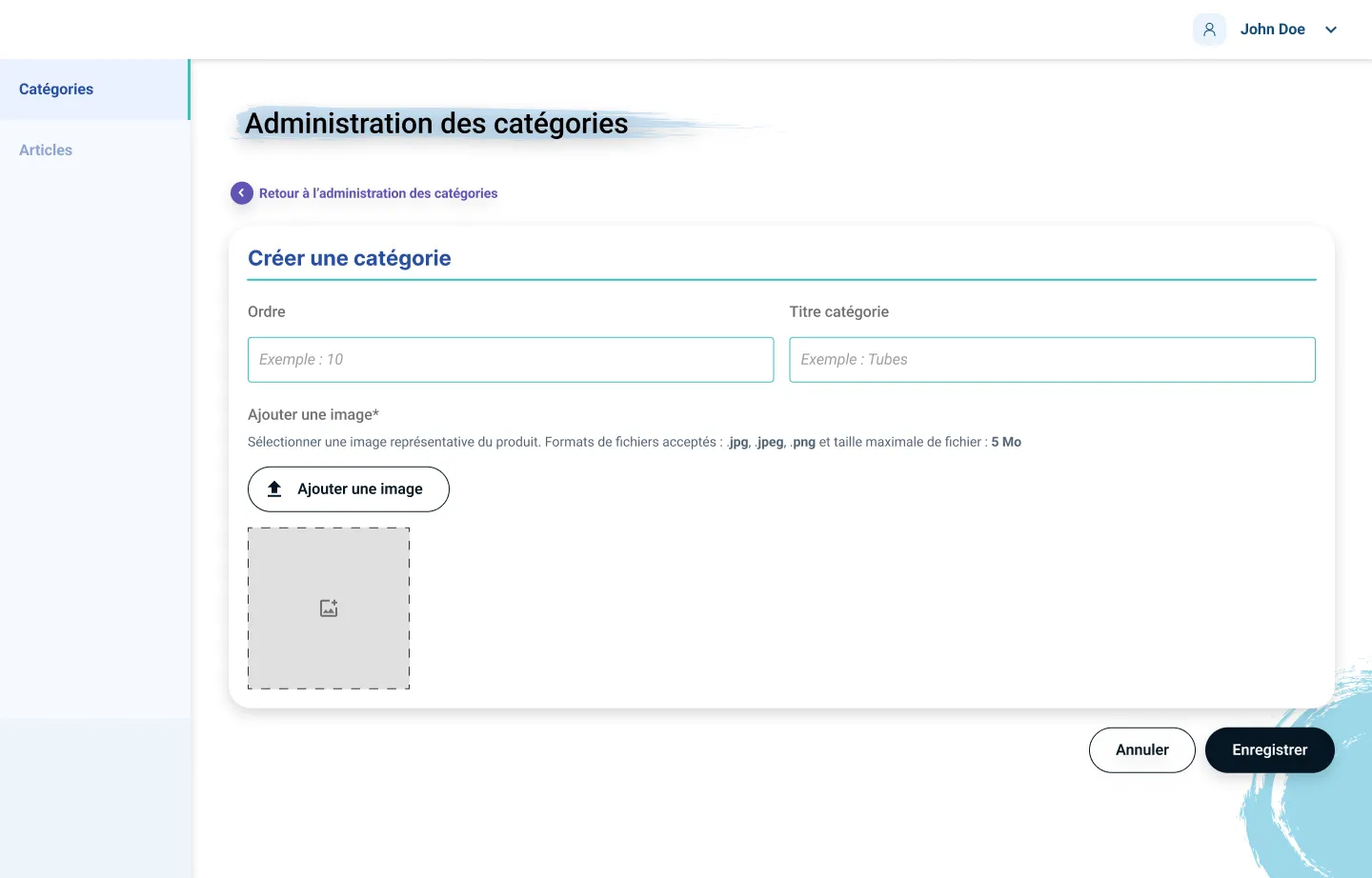
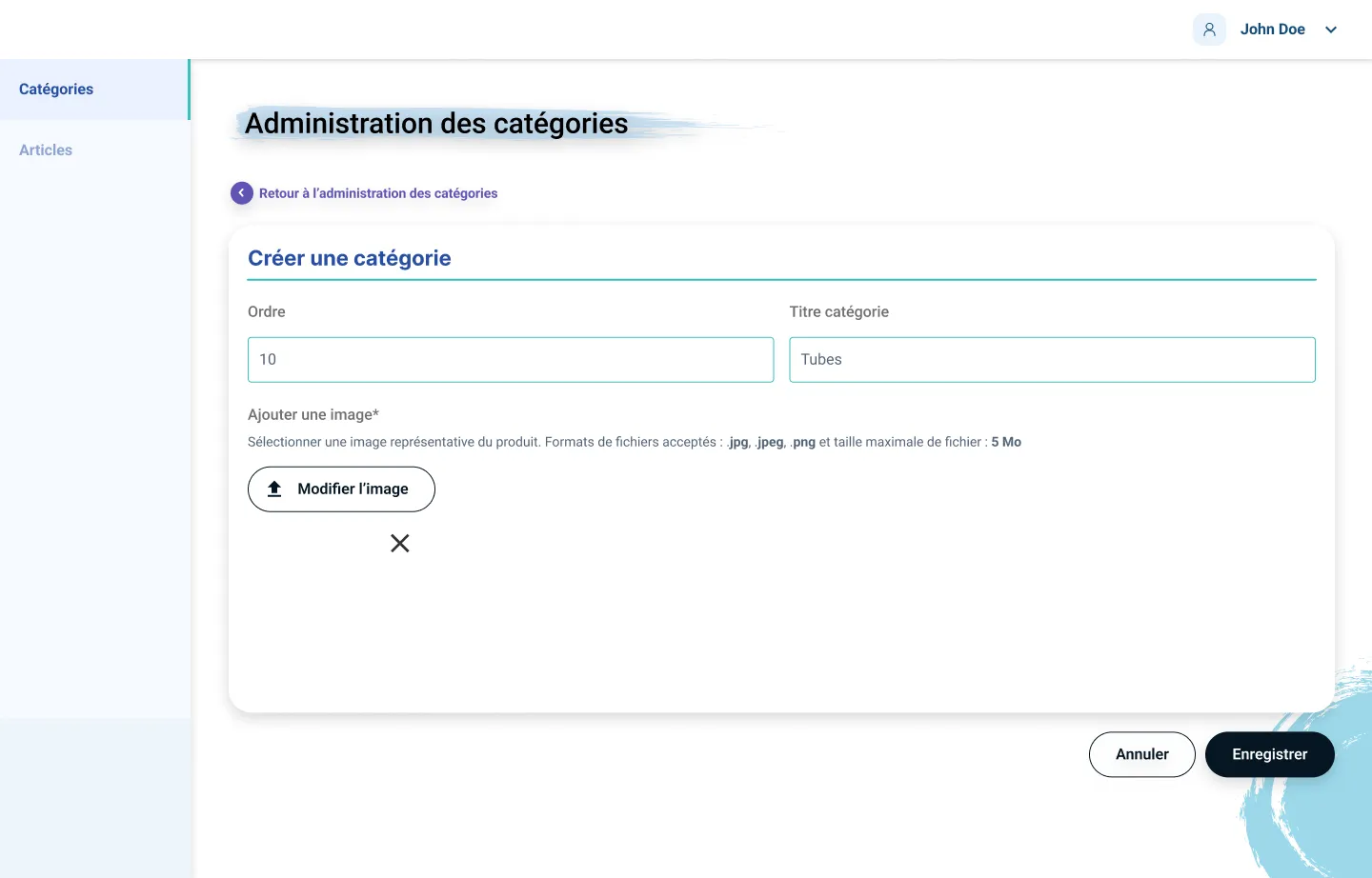
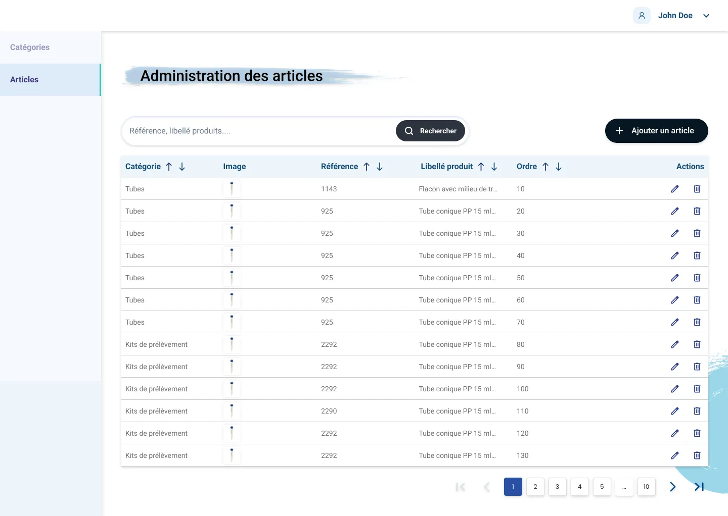
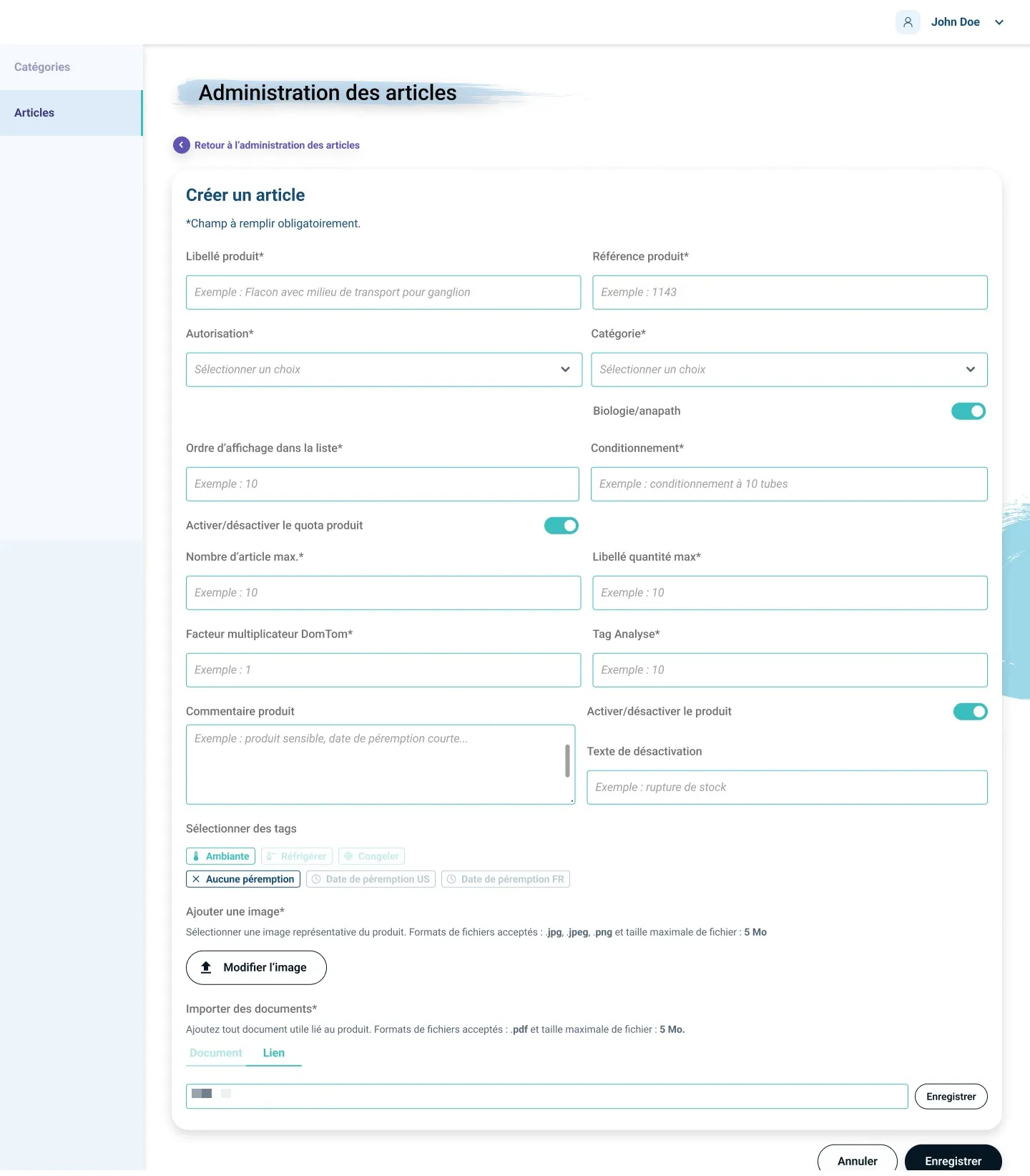
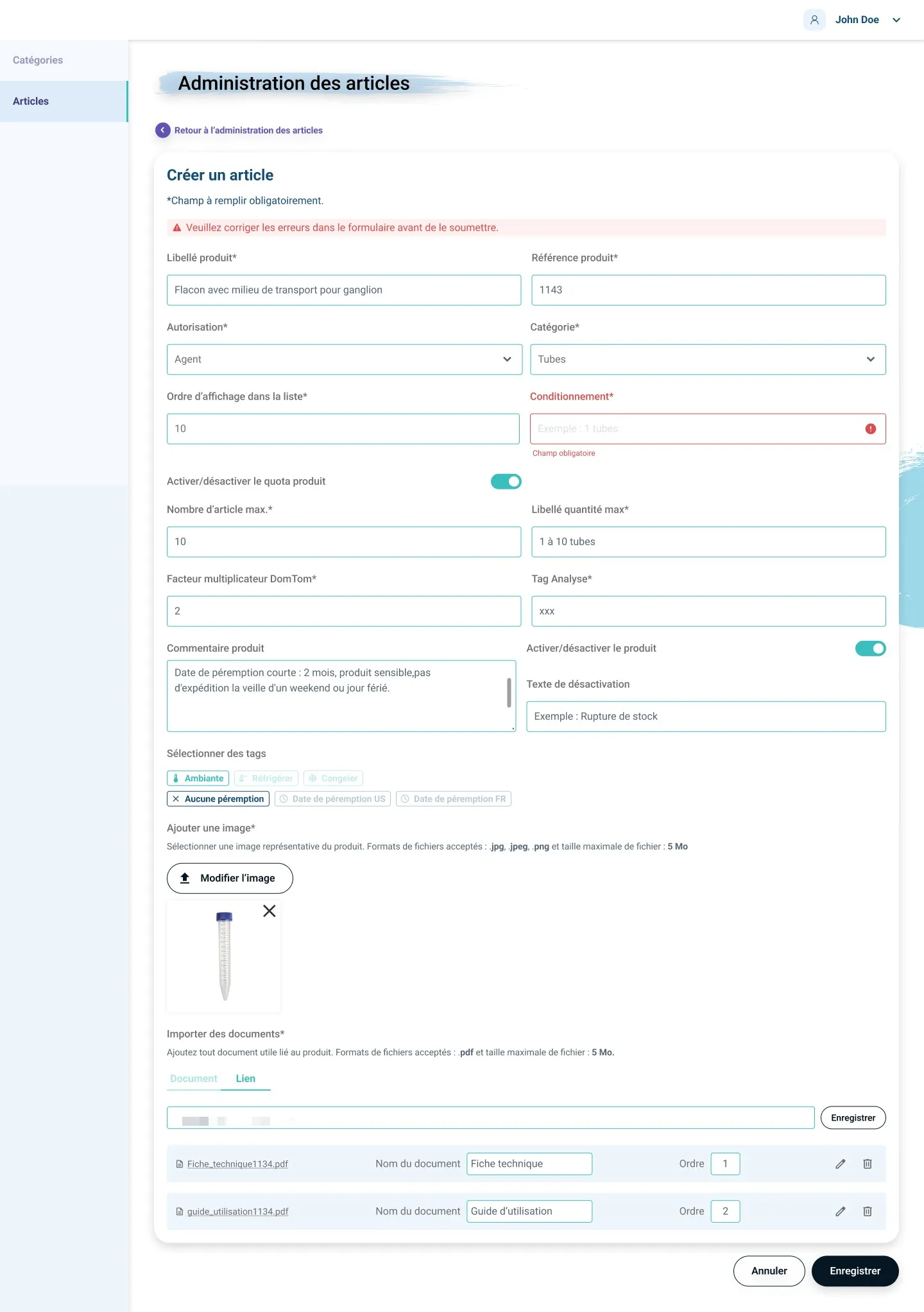
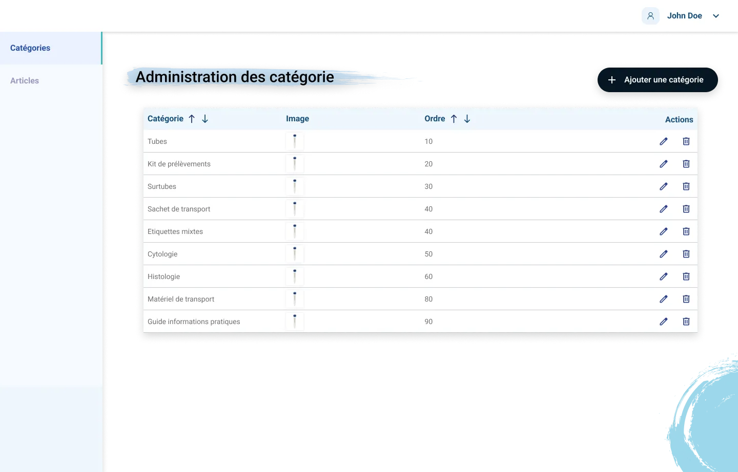
Once the front-end was delivered, phase 2 focused on the backoffice enabling the client’s administrators to manage the catalogue. This scope covers two modules: category administration and product administration.
Fields born in the field:
- Downloadable technical sheets
- Out-of-stock deactivation text
- Storage tags
- DOM-TOM multiplier
Prioritisation: what made the MVP, and why
Decisions driven by field impact.
MVP, included in the delivered scope
- Product technical data sheets (6/8 users)
- Anapath order blocking (technical study required)
- Enriched product labels (5/8 users)
- DOM-TOM / international rollout
V2, deferred to a future iteration
- Order status tracking (Azure feasibility to confirm)
- Stock management and alerts (4/8 users)
Results and learnings
The deliverable
A Figma prototype of both scopes, presented to the client in July and August 2025, ready for user testing.
Client feedback
The client is satisfied: they find the design better, and the backoffice, which did not exist before, made it possible to describe the products better.
Sharper analytical rigour
Analysing these interviews required heightened analytical rigour: distinguishing strong signals from anecdotes, cross-referencing verbatims to identify genuinely recurring patterns, and documenting the limits of the data collection.
The client dimension
Working in an agency context exposed me to the client management dimension: framing feedback, arbitrating between requests and real needs, and justifying design decisions with research-based arguments.
An internal tool, designed for the field
The two-phase logic, front-end first and backoffice second, taught me to design an internal tool while keeping its direct impact on the end-user experience in mind. Every backoffice form field had a reason to exist in the field.
The prototype as a validation tool
A prototype is not a final deliverable: its value lies in what it allows to be validated through user testing. Every interaction decision must be justifiable functionally, not aesthetically.